Spring has finally arrived, I think.
The crocuses are up, the birds are singing, and today, the sun was shining!
We took Frank out for a walk to the dog park this afternoon and met two adorable dogs: Dora, a beautiful Doberman, who won’t leave the house without one of her many skirts on, and her sidekick, Little Ricky, a Chinese crested. They have a bond that is unbreakable.
Dora and Little Ricky are as strange a match as can be. The contrast is quite obvious – Dora is big and strong and Little Ricky is small and frail. One is dark and sleek while the other is highly textured (and even bald in a few spots).

The differences you see in this pair can also relate to the furniture in your home.
We all have an oddball chair, lamp, or table we love, but it just doesn’t seem to jive with the rest of our décor.
In any case, styles and trends change, sometimes pieces work together, and sometimes they don’t.
But what is most important to keep in mind when furnishing your home is to keep some kind of harmony throughout.
It’s not too difficult to do. It just requires a little design know-how and adherence to a few basic rules.
Below are some examples of how I’ve maintained harmony throughout my projects over the years, so if you’re struggling to incorporate something into your home, hopefully this helps.
Size & Scale
Like Dora and Little Ricky, size matters!
Dora looks huge standing next to Little Ricky, and Little Ricky, although his personality makes up for his small stature, looks very small next to Dora.
That being said, the first rule to follow if you want to ensure harmony in furnishing your home is to keep the size and scale of your furniture pieces consistent throughout the space.
For example, don’t put an oversized sofa next to a dainty armchair. The sofa will dwarf the armchair, making the room look awkward and the chair look out of place.
Instead, try to feature the chair in a place where its fine attributes can shine, like on its own in a bedroom or in the entry hall.
The same principles of size and scale apply in other areas of your home as well.
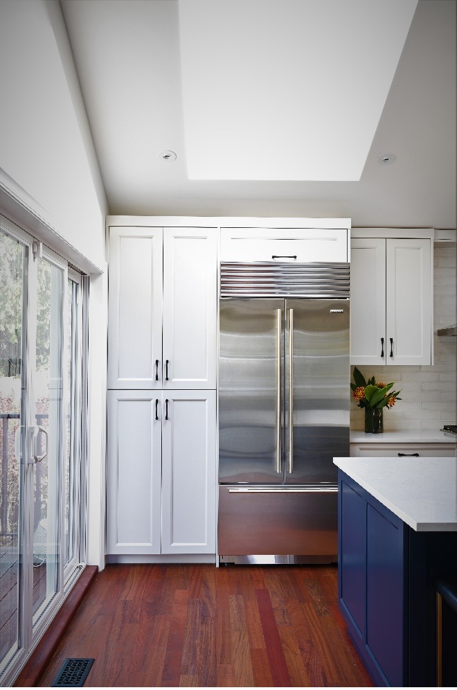
For instance, to make your kitchen look as large as possible, the kitchen cabinets should go all the way to the ceiling. Even if your ceiling is vaulted, take them all the way to the top of the wall. And don’t forget to purchase appropriately sized appliances for the space, as well.
In a bathroom, select a vanity that is large enough for the allotted space and pair it with an appropriate sized mirror.
Balance & Symmetry
Some other things to think about when designing your space are balance and symmetry.
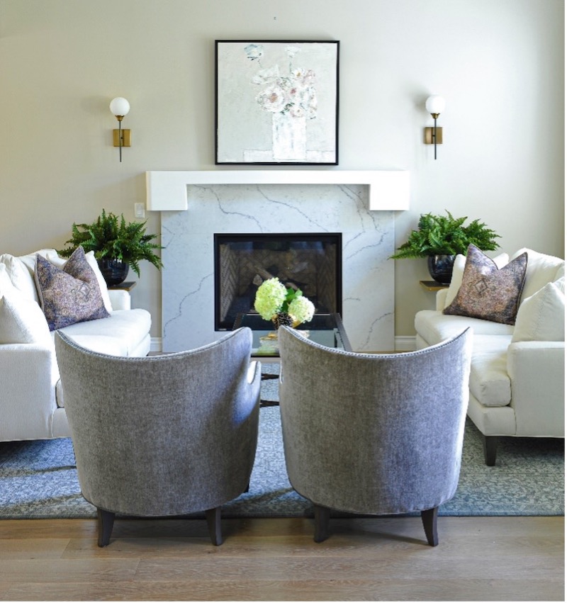
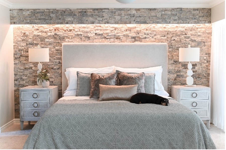
For example, you can use two different end tables with two table lamps that don’t match on either side of your sofa, but make sure the size and scale are similar to ensure balance.
Try to place furniture equally around the room, and create seating arrangements where guests are encouraged to engage in conversation.
If you have a large room, try dividing it into sections.
It’s also good to pull furniture away from the walls by about two to three inches. Believe it or not, this will make the room feel lighter and more open.
Stick with a Single Aesthetic
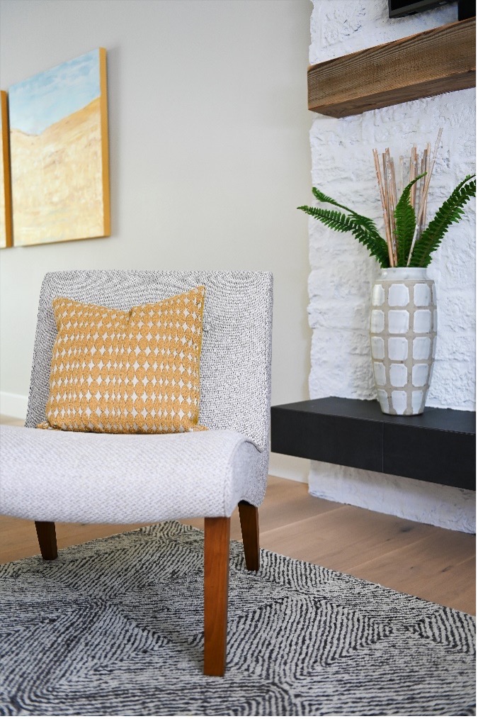
Another thing to remember is to try not to mix things up too much and go with a single style whenever possible.
Decide if the look you are going for is modern, traditional, ornate, eclectic, or minimal, and stick to it.
For example, if you prefer an ornately formal bedroom, don’t introduce modern or casual furnishings. If the look you are going for is minimalistic, don’t hang up frilly curtains!
Use Colour to Create Consistency
Trying to maintain consistency is also a key consideration when it comes to designing your décor, and using colour is one of the best ways to do that.
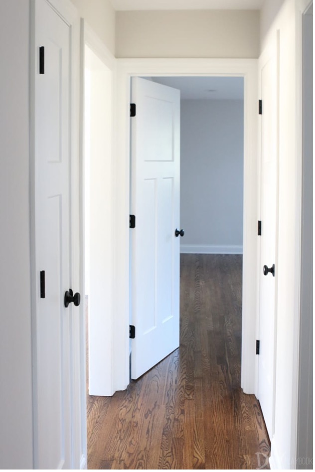
For example, you should try to keep your ceiling and trim colour the same throughout your home.
Even if you change the wall colour in each room, keeping the colour of the ceiling and trim the same in all areas will create harmony and connect all the rooms together.
Mix & Match Textures to Create Visual Interest
While it is important to think about uniformity in your décor, mixing and matching can help to break up that monotony and make your space more interesting.
Having everything shiny and sleek can be cold and boring, and having everything in a room heavily textured and patterned can be overwhelming.
You can create more inviting rooms by mixing smooth and textured fabrics, while also layering in solids and prints.
With COVID restrictions being lifted, we are all looking forward to having guests over and entertaining. If you would like to update and refresh your home décor just in time for the new season ahead, I would love the opportunity to work with you. Please feel free to reach out if you want to know how I can help.

