Ahhh, where to start? Picking a colour scheme for a decorating project can seem like an overwhelming task. There are just so many choices to consider. The ‘colour of the year’ may be beautiful online or in photos, but if it does not work in your home, then it’s a no-go.
When I visit a client’s home for a colour consultation, I look around the room(s) and ask if they have any favourite pieces, such as a vase, area carpet, toss cushion or artwork. Often the reason they are drawn to these items is that the colours are appealing to them. I use the colours found in these items as the ‘jumping-off point’ to the colour scheme.
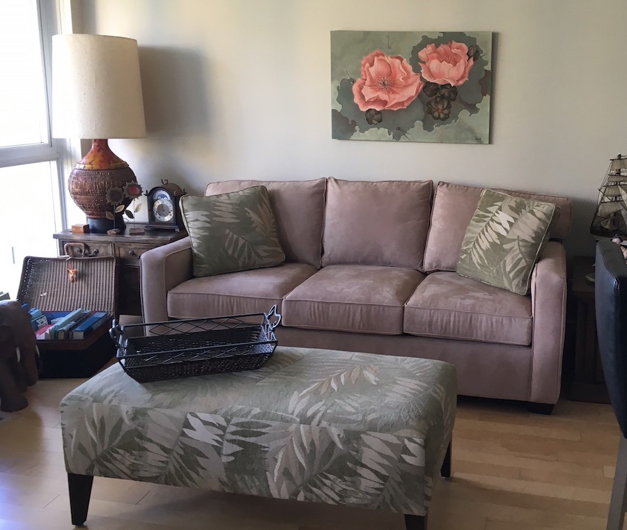
On a recent project, my client asked for assistance to create harmony in her living room. She had an interesting collection of furniture and accessories, none of which really worked together. She adored the floral painting on the wall, so we took our direction from that. The walls were already painted in a soft green that worked well with the artwork so we kept them as is.
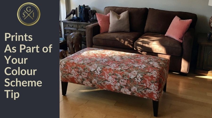
To begin, we swapped out the pinky/beige sofa with a deep brown one she had in another room. The green print fabric on the ottoman and toss cushions competed with the green in the painting and the colour on the walls. In fact, there was way too much green in the room and the painting got ‘lost’.
To tie the whole scheme together, we used the colour of the flower in the painting as the accent colour in the room. The ottoman was recovered in a print that was the same colour as the flower in the painting, with accents of dark green. And new toss cushions (with feather/down fills) were added to give the room new life.
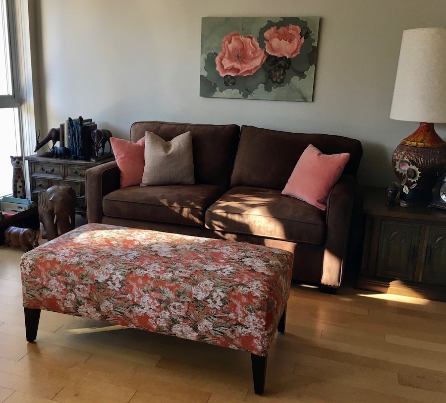
In addition, we moved her cherished vintage table lamp away from the window and into the corner to ‘ground’ the room. Completing this complementary colour scheme are two chairs that sit opposite the sofa (not shown) that are the same colour as the background in the painting.
What a difference a few changes can make! If you’re looking to make some design changes, ask us about picking the perfect colour scheme for your home.