I always find it so exciting to hear what the Pantone Color of the Year is.
I’m really inspired by this year’s choice, because it’s elegant, versatile and oh, so classic. Whether you’re updating an older condo, transforming an empty nest or renovating your family home, it works.
What’s the Pantone Color of the Year?
The Pantone Color Institute announced its Color of the Year in January: Classic Blue. According to the institute’s website, it’s “a timeless and enduring blue” that’s “suggestive of the sky at dusk.”
If you haven’t heard of the Pantone Color of the Year, it sets the tone for everything from fashion collections to home décor.
Experts from the institute travel the world each year to explore what colours are trending in art, design, fashion, movies, sporting events and more before making their decision.
Since 1963, when the Pantone Institute first developed its colour system, it’s color language has guided all colour conscious industries; textiles, apparel, beauty, interiors, architectural and industrial design, encompassing over 10,000 color standards across multiple materials including printing, textiles, plastics, pigments, and coatings.
Bringing Classic Blue Décor into a Client’s Home
I recently completed a large renovation at a home in Coquitlam. The client wanted an open concept in the main living areas to allow for ease of entertaining their large family.
To achieve this goal, all the walls separating the living room, dining room and kitchen were removed.
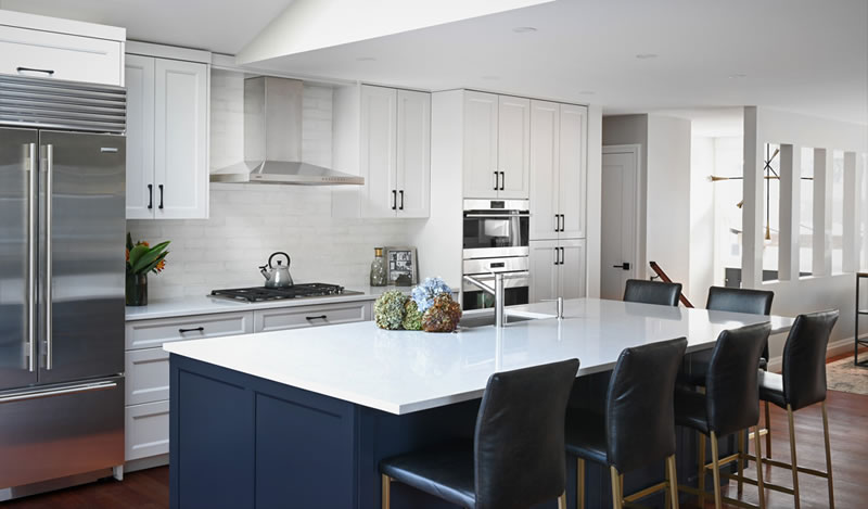
A neutral colour palette was used on the walls, trim, wall cabinets and main furniture pieces. As an accent colour, we used Benjamin Moore Baby Seal Black 2119-30 (which reads as a very deep blue) on the island and bathroom cabinetry.
A combination of deep blue and neutrals throughout in our selection of tile, fabrics, carpets, wall coverings and furniture pieces create a seamless flow throughout the main floor. All fabrics and furnishings are kid and pet friendly, making life easy and effortless.
I worked with a neutral colour palette grounded by elements of Classic Blue flowing throughout the home, including:
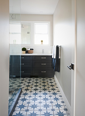
The main bathroom: Hanging up towels or a shower curtain isn’t the only way to give a bathroom a pop of colour. From the cabinetry to the unique tiled floor, I worked rich blues into its very foundation.
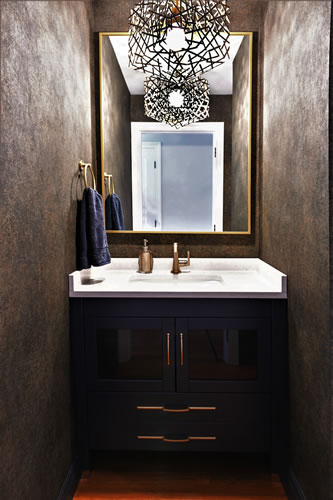
The powder room: Think beyond solid colours when you’re setting up your space; consider patterns that breathe life into rooms. I love how the wallpaper subtly combines earthy tones and blues to add depth to the walls.
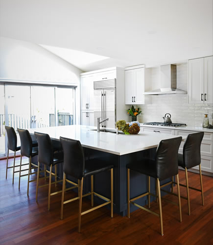
The kitchen: Using a single hue too much in one space can be overpowering. I kept the kitchen design light and airy and grounded it with a blue kitchen island and chairs.
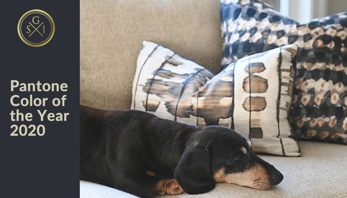
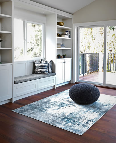
The living room: Maybe you don’t want to swap out your carpet, paint your walls or buy new furniture.
There are still so many décor options available to inject the colour of the year – toss cushions, blankets and throws, poufs, candles, vases, etc.
Time for a fabric rejuvenation? Read my blog on how to Refresh Your Home with Custom Upholstery, Slipcovers and Draperies.
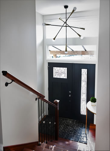
The entryway: Don’t forget about the entryway to your home! It’s the first thing people see when they walk through your front door. I used deep blue on the front door and added a blue rug to welcome guests and tie the entryway into the overall design scheme.
I hope this gives you a glimpse of how easy it can be to instill calm and confidence in your home with this vibrant, versatile hue. You can see my entire Latimer Avenue project here.
Let’s chat about how we can seamlessly bring the Pantone Color of the Year 2020 (or any other colour) into your home—from paint colours and wallpaper to custom upholstery and bedding.
